
I have been asked several times recently how I go about with watercolors, so here’s a short writeup describing my workflow.
[note: I am just a hobbyist. Please consider taking virtual lessons from a professional artist. Why?
1. You will get much better guidance and instructions
2. Freelance artists are some of the worst hit professionals from COVID-19. If we care for art, it is our moral duty to support those who risk their livelihood on creating it
3. If the lessons are too expensive, you can still email the artist and ask- given the dire circumstances, chances are they might be flexible with the class fees.]
 |
| Painting Bear Creek Spires from Mosquito Flats, Eastern Sierras, March, 2020. |
Watercolor is my preferred choice of medium because I found it to be the fastest and most expressive way of depicting the inspiring scene before me. I often paint plein air in the backcountry. My focus is always on getting the painting done ASAP. There are endlessly methodical ways of going about watercolors: draw a thumbnail value sketch, then a pencil sketch, then apply a diluted wash then a second one and finally a third one etc. Not to mention the tricks one can do to create textures. All these fancy things may result in a great painting, but often compromise the spontaneity and freshness, and usually take far more time. My approach is to do the bare minimum to capture the essence of the lovely scene in front of me.
 |
| Direct watercolor is blazing fast. This live sketch of Pantalaimon took less than 5 minutes. If you look closely, you can see all individual brush strokes. This is what I mean when I say that direct watercolors are the most expressive medium when under a time crunch. The paper is NOT a 'watercolor' paper nor it is archival. It still works well, don't you think? |
Here’s how I do it:
Materials
I use minimal materials. Minimalism in equipment serves two purpose: it saves time, and since you always use the same few things, you end up getting really good at using them!
 |
| Here's a good peek into my plein air setup. My DIY palette, the colors, and direct watercolor of Soyumbhu Temple in Kathmandu, October, 2019. |
- Paper. I often draw several scenes back-to-back and can’t really wait for each of them to dry before starting the next one. This rules out sketchbooks. Carrying a sketchbook also means carrying the dead weight of all the previously done paintings. Instead I use quarter-sheets cut from loose sheets. It works out way cheaper this way, and you can get 2-3 times the area -that too of a more professional grade paper- for the cost of average sketchbook (which likely has sub-optimal paper). They are cheap, and I can add a variety of them. I prefer 140lb paper as it is light and yet sturdy enough for watercolors. A heavier 300lb paper intimidates me, so I almost never use it! I understand a lot of professional artists recommend getting the best paper affordable. That is certainly true, but I believe you can use anything optimally by using its strengths and minimizing its limitations. I’ve made quite a decent sketches using a cheap $5 sketchbook with 65lb paper.

Paper and brush don't matter that much. Made using a water brush and a 65 lb non watercolor paper. Since the brush lacks a fine point, I used pen/ink to add details and as a 'honey layer' (more described below). Bryce, November, 2018 - Brush. I mostly use just one brush- a size #8 Princeton Neptune. This negates the dilemma on when to switch brushes etc. I also carry another brush which would only be wetted with clear water, and serve to soften the edges made by the #8 in a rapid sketching session. I've found that brush type doesn't matter as much as the quality of the paints. Naturally, if a brush doesn't make a fine point, you can't draw finer details. At that point you can replace it, or get a smaller one just for details, or just draw bigger drawings, or avoid painting pointed lines altogether and use a pen instead (ink and watercolors look beautiful!). Synthetics work well enough and are cheap and expendable. Size #8 Princeton Neptune cost me $7.

Recently, I switched to a two-brush setup of a larger quill and a #2 round. While they work great, I miss the simplicity of a do-it-all single brush. Hence have started reverting to #8 again. Another look at my chaotic palette. Squiggly Tree on El Prieto trail, February, 2020. - Paints. I use only 8 paints: split primaries (warm and cool triads of red, yellow, and blue = 6), Burnt Sienna, and Neutral Tint. I mostly use burnt Sienna with Ultramarine blue to create various shades of grey. These along with a warm yellow form my mostly used triad- I recently discovered this actually has a name! Velasquez palette! Neutral Tint mutes colors while keeping their essence. if I could have only four colors, these would be it. The fifth would be a magenta (cool red). The sixth would be phthalo blue (cool blue). A cool yellow, and a warm red are nice to have just to give an infinite range of colors. I fall into the category that never wash palettes. This is to say that I don’t really think in terms of what exact color shade I am using. Fussing over colors unnecessarily complicate things in the backcountry. Instead, I just think of colors in “-ish”. "Is it reddish enough? Greenish? Warmish-greenish? Bluebird sky blueish? Sierra granite greyish? Joshua tree granite-ish? " etc. this takes away a lot of pressure! I’ve only used Daniel Smith and don’t have a reason to complain against them. If you are on budget, between paper, brush, and paint I'd say invest in the best but limited number of paints, cheapo brush, and a few loose sheets of decent (140 lb) paper. Following are the colors I have:


Warm/orange
red: Pyrol Orange
|
PO73
|
Cool/violet
red: Quinacridone Rose
|
PV 19
|
Warm/orange
yellow: New Gamboge
|
PY153
|
Cool/green yellow: Hansa Yellow Medium
|
PY 97
|
Warm/green blue:
French Ultramarine
|
PB 29
|
Cool/violet
blue: Phthalo Blue
|
PB 15:3
|
Earth Color: Burnt Sienna
|
PBr 7
|
Grey: Neutral Tint
|
PBk 6, PV 19, PB
15
|
- Palette. Since I don’t think in terms of exact colors, I like having a large area where I will make a puddle with varying colors. For example, if I want to mix grey, I will make a puddle of burnt sienna and next to it make a puddle of ultramarine blue. Then I’ll drag them mid-way to create a puddle of grey, but it won’t really be a homogenous mixture, but rather, a spectrum of greys starting from ultramarine blue and ending in burnt sienna. Every time I reach out for paint, I’ll dip into different places in the puddle- say warmish to represent lighter areas, or bluish to represent shadows. This gives infinite variations of greys and the resultant wash looks lively and intricate. It’s stupid simple, really. For backcountry plein air, I made my own palette which serves as a palette with giant mixing wells, as well as a support to hold the painting and water container. More on that later. But any palette or tray or a saucer is okay to begin with. A white-colored palette is preferable as it makes it easier to see the shades you've mixed.

When home, I use a bigger palette in order to not overuse my field palette. Thus, would like to iterate that it doesn't really matter which palette you use as long as they are white.

Process
Typically, paintings are done in multiple washes called as glazing. The first wash is the most dilute one and lightest color in the painting. Think of bright highlights in the painting. The next one would be darker and so on. Together, these generate a sense of depth, as the lightest layer shows through the upper layers. The key limitation of this process for me is having to wait for the washes to dry up. To fasten the process, artists often use hair driers. Obviously, that is not an option in the backcountry, and I feel weird to use such a high-tech tool to do something as simple as drying the paper! My preferred way of painting is a lot simpler. It all comes down to shapes, hard and soft edges, and values. A lot of it has been well described in 'Urban Sketcher' by Marc Taro Holmes. If I could recommend you only one book as a beginner nature watercolorist, this would be it. Yes, I know it is directed towards urban sketchers, but it succinctly describes the minimalist approach I use to painting nature. Another book that I really like -and this one is targeted towards nature watercolors- is Carl Purcell’s ‘Your Artist's Brain: Use the right side of your brain to draw and paint what you see - not what you think you see’. It is a fantastic book, but it aligns quite well (is consistent) with the approaches and techniques that Marc Holmes describes in his book. Hence, if you could afford only one book, I’d still recommend the Holmes book. (I’ve read more than 20 books from the public libraries and own several of them, including the Gordon Mackenzie book that has virtually every trick one can do with watercolors. For fast and loose style, the Holmes and Purcell books would suffice).
A simple breakdown of my process is as follows:
- Start with watercolors directly! This is probably the number one reason my paintings look the way they do, and they get done so fast - almost always less than 30 minutes. I find pencil sketching/ pen lines predefine the scene for your brain. Your painting ends up being more of a ‘filling in’ the colors in a coloring book. When there is nothing on the paper, painting becomes a highly iterative process- each future step depends on the current step. This is highly conducive to expressing your emotions as well as making quick decision and follow your impulses. Or painting what ‘really’ excites the 'inner' you. Think about it- you drop in a really thick paint and it will dry up in seconds so you have to keep painting. This somehow overrides your brain and you go in a trance almost immediately. Later, you’d be amazed how many things you ‘left out’ of the painting. Painting directly also provides an instantaneous feedback- you know more or less exactly how that part is going to look like in the finished painting.

Start painting directly with watercolors to get a 'certified fresh' look. Raspberry, March 2020. - Think of the painting as an arrangement of 2-8 large shapes or objects. Each shape will be identified from the others by a hard edge. If the edge is not hard, then for our purpose, it can be a single object. A shape or object here is simply a connected mass of values that can be seamlessly blended. e.g. The foreground can be a single object though it’d have trees, rocks etc. Or a range of mountains can be a single object. Or the entire sky would be a single object. Inside of an object or a shape, there should NOT be hard edges. Only seamlessly blended medley of colors and values. Since I am painting directly, I usually restrict the painting to only 1-4 big objects. Mountain peaks or rock climbing routes work great. I obviously can’t plan for detailed landscapes without sketching first (and spending a lot of time), hence this forces me to select only a handful shapes that really speak to me. I call these ‘earth portraits’. These work especially well plein air, looking as up close (with a human vision that equates to about 45mm focal length's field of view on full frame SLR ) these objects can be seen obviously. Take a picture with a iphone (28mm full frame equivalent field of view) and they get lost! Even if there is a great expanse in front of me, I only choose a few objects. Then I simply start 'drawing' with a juicy loaded brush!

Though there are several rocks/ boulders here, they are treated as a single layer. Cracks are painted after the first layer has dried, as is some dry brushwork to create texture in the lower right. The rest of the painting is all one variegated wash. Apple Valley, November 2019 
There are 5 major shapes: the sky, the reflected ground (including the pond, the marble, as well as the reflection of the monument), the shrubs, the monument, and the people. Washington Monument, Washington D.C., December 2018. All paintings in this article are direct watercolors. However, including one that started with a pencil sketch. While it's one of my popular painting, it has a structured, 'mainstream' look. - The 'chai' wash: Do 90% of the painting in a single layer/ wash. In his book, Holmes refers doing a painting in three washes: a diluted first wash with a consistency of ‘tea’, then after it dries, a second wash with thicker paint with the consistency of ‘milk’, and finally a third one with thick dark paints/ values with a consistency of ‘honey’. In the interest of time, I combine the tea and milk washes together in a single first wash. It is already quite bright and saturated, and would be the first and final thing to touch most paper area. The drawback here is that if I miss a spot or two, the white paper would show through. I don’t mind this and I believe it gives it the ’sketch’ or spontaneous feel. Since it is a combination of tea and milk, I call it a ‘chai’ wash! This is how I go about the ‘chai’ wash:
- I start with a big object, typically with its lightest tone. The moment of a loaded brush touching a new paper is magical. And infinitely satisfying. every time I reach for colors, I pick up a new shade, this creates intricate variegated patterns. Then as I turn to shadowy side of the object, I’ll pick a darker color or simply add Neutral Tint into the existing one. The key is to continue growing the wash till it covers the entire object, without getting it dry. If it dries in the middle of an object, it will create a hard edge that will be difficult to hide. As you are ‘growing the wash’, keep adding darker tones/ values/ colors into the lighter ones to create texture or shadows. This is called ‘charging in’, or ‘tapping in’.
- Once you are done with the first object/ shape, only then move to the next one and so on till all the shapes are done.

The 'chai' wash. It is as bright and saturated as this painting is going to be. The next wash will simply add a few details. Echo Cliffs, April, 2020 - The 'honey' wash: To quote Taro Holmes, the honey wash is so thick and dark, and used sparingly it’s almost like doing calligraphy. The need for this second wash is governed only by the need for hard edges. The honey wash is given only if 1) I need hard edges over the paint: think of sharp shadows of one object falling over the other; 2) carving out a smaller shape from a bigger shape; and 3) adding texture on the surface of a shape, typically done using a dry brush technique. The honey wash, though used only on sparing surface, is extremely important as it gives the painting a ‘punchy’ feel.

Completed with 'honey' wash. Notice the edges, dark shadows in the middle and right rocks. While this finished version also has the sky, this would have technically been a 'chai' wash. I decided to add the sky and the vegetation at the last minute.


That is all there is to my paintings!
Some resources (specific to this style) to get started with
Some resources (specific to this style) to get started with
- Flat wash. https://www.youtube.com/watch?v=ycYL8DvYSGc. A good starting point to start watercolors is by learning a flat wash. Washes are valuable in understanding how much to load the brush with pigment, how much is too diluted. Err on the side of dilution. Note how in this video a syringe is used to add water to create the mixture. Next is to draw random objects and paint a wash inside of these. Then once the wash is dried, paint a uniform wash outside of the shapes. The video uses a couple of lotuses, but the shapes can be simple circles/ rectangles.
Avoid hard edges at any cost. If you get them, that means the wash needs to be more diluted and you need to move quicker. I was testing the 65-lb paper sketchbook for its handling of watercolors. Doing a wash made me realize I'll have to use really thin washes and only a couple of them (along with 'charging in'). Once I realized it, I was free to use the sketchbook for daily watercolor practice! - Graded wash: https://youtu.be/Q3tQ_lvuHZU
- Variegated wash. After learning a flat wash in positive (inside shapes) and negative (outside shapes) way, it might be useful to learn variegated washes. There are many ways to go about this, but I prefer simply pre-wetting the paper, and loading all colors simultaneously, then moving the paper around to letting them mix well. One of my favorite artist Joanne Thomas Boon demonstrates this to perfection here: https://youtu.be/q-_ltqi--5A.

I don't usually don't do 'clean' washes like these, but practicing variegated washes serve two purposes: doing them correctly means that you know how to do a flat wash and a graded wash, and you get to see how colors mix (point #5 below). Sometime in 2018. You might notice the tape here. Last year I stopped taping the paper. quarter sheets work well with simply attaching 4 magnets (8 in all) on the four sides. A lot more sustainable alternative to tape. - Values study. Once you get a hang of washes, learn see and paint values. It is the values and not the colors that make a painting interesting, so nailing them is the key. Look at breathtaking pictures of Ansel Adams and you'll know what I mean. It is also a lot easy for a beginner to work with a single color instead of learning how colors mix. So a Neutral Tint works great in this setting. Here's fantastic demonstration in direct watercolors: https://youtu.be/GTXeWhgDSIY. Or this one (if the first one is too intimidating) https://youtu.be/7NVa0yTPgt8. Or this one http://www.artgraphica.net/free-art-lessons/drawing-and-sketching/simple-sketches-tutorial.html.

My first reaction after watching Free Solo in Hollywood, CA, September, 2018. I got to see Honnold after the screening as he took questions (and swore and apologized several times. Clearly, he is not used to interacting with LA movie public) 
I go monochrome whenever I experiment with new things, as I try to minimize the variables. Don't know how to mix a skin tone? don't fuss, just use Neutral Tint! This is direct watercolor features a negative painting style with minimal brushwork, and took less than 2-3 minutes to complete. I may or may not have blown over the darks in the middle to make them dry faster. Shh! March, 2020. - Color mixing. There are countless videos on the subject. For our approach, this is the most overrated thing in watercolors. Keep it simple. Take burnt sienna, add a bit of ultramarine, you'll get grey. Take phthalo blue, add a bit of lemon yellow, you'll get cool green. Ultramarine + warm yellow will give you warm green. So on and so forth. However, just to provide a glimpse of how many shades you can get with just three colors, here's a nice video demonstration: https://youtu.be/67d7qclCRS0.
- Charging in. A technique I use a lot in the first ('chai') wash. Simply stated, it is just dropping in color from a loaded brush onto a wet paper- either pre-wetted with just water, or that already has a wet wash on it. Artist Andrew Geeson uses this technique a LOT to get his lovely loose watercolors. See how he pre-wets the paper and then drops in the color: https://www.youtube.com/watch?v=ZoDo0tdR2Ks. Check his other excellent video demonstrations as well.
- Edge softening. A technique I use a lot during my second wash, or whenever I need more control. A clear demonstration of softening an edge: https://youtu.be/Iu1V9q0Pzyw
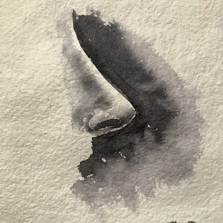
The soft shadows of the nose are all done by softening edges. This simple technique provides a lot of control and can be used for detailed work (for which I usually don't have enough patience nor time :P). - Identifying big shapes. A nice demo on how to identify big shapes, and not to overthink colors https://youtu.be/ldZBqywAt84
- Finally, a few demonstrations by Marc Taro Holmes:
- Direct watercolors: https://youtu.be/05cqwuyLyr8. The lion statue is closer to how I approach my sketches. Free instructional is available here. Marc has an entire book written on Direct Watercolors, but I think if you get Urban Sketchers, you've got the techniques covered.
- Edge pulling: https://www.youtube.com/watch?v=JkXM2sGyon0
- growing a wash: Watch how Holmes treating the entire face as a single object, and making the tea wash: https://www.youtube.com/watch?v=5IF7uQQrptk . Note how he starts the second wash ('milk') at 2:59 and third layer 7:19.
- A 'cheat sheet' of his workflow. Covers identifying big shapes, charging in, and edge pulling.


Good luck! Show me your sketches. I am from Pune, so critiquing is in my blood!
- Hrishi
- Hrishi